ALBUM COVER DESIGN
Not so long ago, there was an art form known as Album Cover Design! Remember the days that you could listen to the music on your turntable and comfortably read the album notes?
Shown here are some of the LP projects completed during the 80s and into the 90s which I enjoyed designing and also some of which posed interesting design challenges.
Whenever I picked up a new project from Rounder Records, all was given in those days was typed text, which I would painstakingly cast and have typeset, before the days of computers!
In addition, I was handed one or more photographs which more often than not, ranged in definition from tack-sharp to blurry, or various color slide formats, and in a couple of memorable cases...just photocopies on paper! Not up to my standards usually, but, the pleasure and the challenge to design these album covers allowed me the freedom to experiment, which more often than not made these projects most enjoyable.
Click this link to see more of these LP sleeves.
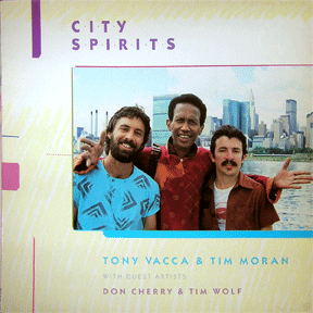
Tony Vacca lived in Massachusetts at the time I worked on this cover... Rounder had very few jazz artistes on their roster, and the record company and I thought a linear modern-art approach would work well for the cover art.
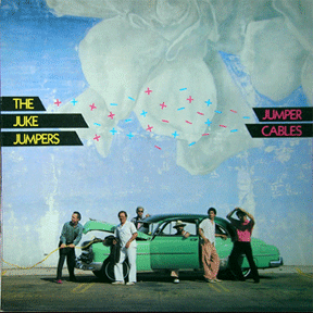
A cool photo of a Rockabilly band needed an unusual typo-graphic approach, especially since the background was so unusual... this is what I came up with... fun!
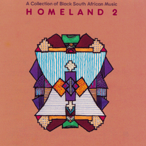
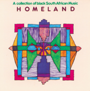
The success of the first Homeland LP prompted a second collection and the request for a new cover, again illustrated by Jesse Aaron Green.
Ten photos of South African groups and the realization that no one group should get the "star" role photo on the cover – a designer's dilemma! My 10-year old son, Jesse Aron Green drew an asymmetric design with markers which was the perfect inspiration! He redrew a tighter version with graph paper to guide him, over a flopped stat of his earlier design for symmetry. The LP was nominated for a Grammy!
The photograph submitted for this project was an unusual choice, and so a light, almost sepia tint approach was used to good effect.
Rounder distributed this LP in the USA, which called for a re-design of the cover, using the same illustration and adding my own graphic nuances and typography.
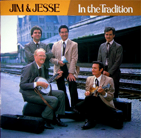
I worked directly with Jim of Jim and Jesse by telephone to produce the cover graphics which was a pleasure for me... he especially liked this photograph, so I accentuated the warm flesh tones by choosing the yellow and ochre bands to brighten up the otherwise cool background.
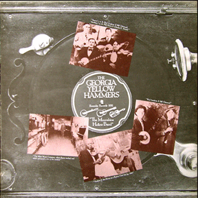
Here is another case of "another batch of not so good photos of a band of varied old-timey musicians... so I talked it over with Bill Nowlin at Rounder and I suggested we commission a special photograph of an old record player, and I superimposed the photos. A solution which looks old and appropriate.
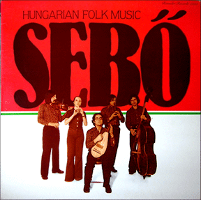
Yet again, all that Rounder had for this record was just a few photos of the unusual European instruments and a cover group shot... so I made the best of it using a quadtone approach with bright CMYK colors to make a stand-out design....
A rare case of the artiste providing two really good large-format shots for the cover. All I did was use them with some bold typography in complimentary colors with sparse notes on the back to produce a nice cover.
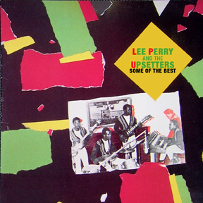
The photographs provided for this LP were really not very good one's, so I chose to make the most of the vintage nature of the music, by coming up with a torn paper collage, which made the cover really stand out from other Reggae LPs...
Combining a really good color photograph along with vibrant colors in an illustrated frame, and simple typography resulted in a very colorful cover... I wanted the cover treatment to look hand-made so I drew the background artwork with markers on very absorbent watercolor paper.
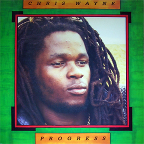
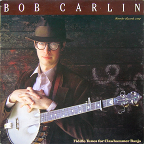
Bob Carlin is an Old-Timey musician from the Philly area, who also provided a very good photo. I designed the color scheme of the graphics to enhance the colors in the the photograph.
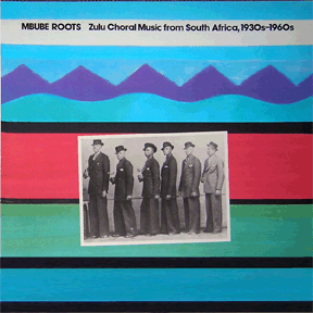
Mbube is a style of Acapella singing from South Africa... groups of mineworkers would gather in singing clubs, and perform competitively in this wonderful vocal style. To achieve this soft art, I used magic markers on watercolor paper. Simple, colorful and effective. FYI: Mbube is also the original title of the tune that morphed into the hit "The Lion Sleeps Tonight".
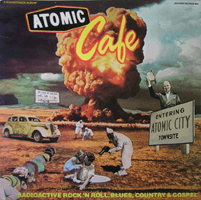
A cult movie with really cool music from that time... the illustration and the typography were adapted from the movie poster... the back cover called for an unusual approach so I used photos from the publicity package.